

Newsletter images play a crucial role in engaging your readers. They can enhance your message and capture attention quickly.
In today’s digital age, visuals are more important than ever. Well-chosen images can make your newsletter stand out, improve readability, and boost click-through rates. But not all images work well in newsletters. Some can slow down load times or appear distorted.
Understanding best practices for newsletter images is essential. It ensures that your visuals enhance your content rather than detract from it. This guide will help you choose the right images, optimize them for email, and use them effectively. Let’s explore how to make your newsletters visually appealing and effective.
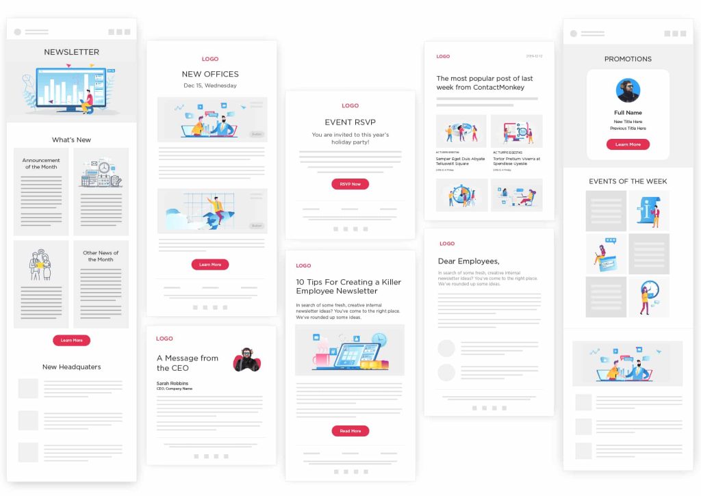
Credit: www.contactmonkey.com
Choosing The Right Images
Selecting the right images for your newsletter can make a huge difference. The right images can draw attention, support your message, and improve engagement. Let’s explore the key factors to consider when choosing the right images for your newsletter.
High-quality Resolution
High-quality resolution is crucial for your newsletter images. Blurry or pixelated images can make your newsletter look unprofessional. Always choose images with a high resolution to ensure clarity and sharpness.
To achieve this, use images with at least 300 DPI (dots per inch). This ensures your images look crisp on all devices.
| Image Type | Recommended Resolution |
|---|---|
| Banner | 1200 x 600 pixels |
| Thumbnail | 150 x 150 pixels |
| Body Image | 600 x 400 pixels |
Relevant To Content
Images should be relevant to the content of your newsletter. They should support the text and provide visual context. Irrelevant images can confuse readers and reduce engagement.
Consider these tips to ensure your images are relevant:
- Use images that illustrate the main points of your text.
- Ensure the images match the tone and mood of your content.
- Choose images that add value to the message you are conveying.
For example, if your newsletter talks about healthy eating, include images of fruits, vegetables, and balanced meals. This helps readers understand the content better.
Remember, the right image can speak louder than words. Choose wisely.
Image Formats And Sizes
Choosing the right image formats and sizes is crucial for your newsletter. It can greatly impact the load time and overall user experience. The best practices focus on using the optimal formats and sizes to ensure quick loading and clear visuals.
Preferred Formats
Use JPEG for photos and images with many colors. It compresses well and maintains quality. For images with few colors, like logos or icons, PNG is ideal. It supports transparency and maintains sharpness. Avoid using TIFF or BMP as they have large file sizes. They can slow down your newsletter.
Optimizing For Speed
Reduce image file sizes to improve load times. Use image editing tools to resize and compress your images. Aim for a file size under 100KB if possible. Consider using responsive images. They adapt to different screen sizes and resolutions. This ensures a faster load time and better user experience.
Placement And Layout
Effective placement and layout of images in newsletters can greatly enhance the reader’s experience. Properly positioned images can guide the reader’s attention, break up text, and make your content more appealing. Below, we delve into the best practices for strategic positioning and balancing text and images.
Strategic Positioning
Strategic positioning of images can direct the reader’s focus. Place images near important text to highlight key points. This helps in grabbing attention and making the newsletter more engaging.
Consider the following tips for strategic positioning:
- Place images at the top to capture immediate attention.
- Use images in the middle to break long text blocks.
- Position images at the end to leave a lasting impression.
Ensuring your images are strategically placed can make your content more memorable and effective.
Balancing Text And Images
Balancing text and images is crucial for readability. Too many images can overwhelm; too much text can bore. Strive for a harmonious balance.
Here are some tips to achieve this balance:
| Aspect | Recommendation |
|---|---|
| Text to Image Ratio | 1:1 for a balanced look. |
| Image Size | Keep them proportional to text blocks. |
| Caption Use | Use captions to add context to images. |
A well-balanced newsletter ensures that images enhance rather than detract from your message.
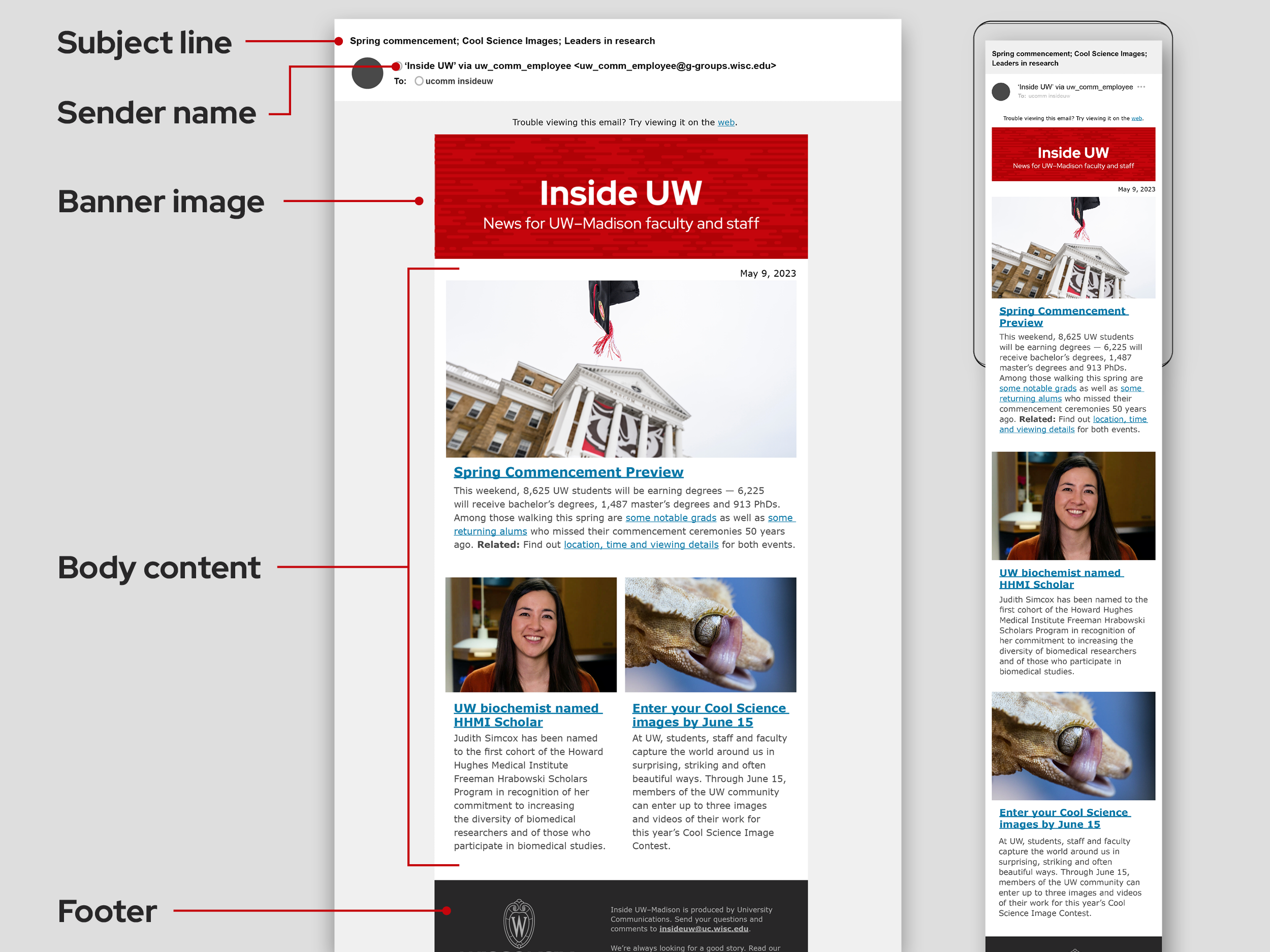
Credit: brand.wisc.edu
Consistent Branding
Consistent branding in newsletters helps maintain a unified look. It builds trust and recognition with your audience. Readers quickly identify your content. This familiarity enhances their engagement and loyalty.
Maintaining Visual Identity
Consistency in images reinforces your visual identity. Use the same style, tone, and theme. Align your images with your brand’s overall aesthetic. This helps create a cohesive experience for your readers.
Opt for similar filters and editing techniques. This ensures all images look part of the same family. This uniformity strengthens your brand’s visual identity.
Using Brand Colors
Incorporate your brand colors in your newsletter images. This ties the visuals to your brand. Use these colors in backgrounds, overlays, or text within images. It creates a seamless connection to your brand.
Stick to your brand’s color palette. Avoid introducing new colors that might confuse your audience. Consistency in color usage solidifies your brand’s presence in their minds.
Accessibility Considerations
Newsletter images make your content engaging. They also need to be accessible to everyone. Accessibility considerations help all readers enjoy your content. This includes people with disabilities. Let’s explore some key practices.
Alt Text For Images
Alt text describes your images. Screen readers use it to tell visually impaired users what the image shows. Write clear and concise alt text. Describe the image content and function. Use simple words. Avoid phrases like “image of” or “picture of.” Be specific. Describe the image’s key elements. This makes your newsletter more inclusive.
Readable Fonts
Font choice impacts readability. Use clear, simple fonts. Sans-serif fonts are often easier to read. Choose a font size that is large enough. Avoid overly decorative fonts. These can be hard to read.
Ensure good color contrast. This helps readers with color blindness. Light text on a dark background works well. Dark text on a light background is also good. Test your newsletter. Make sure all text is easy to read.
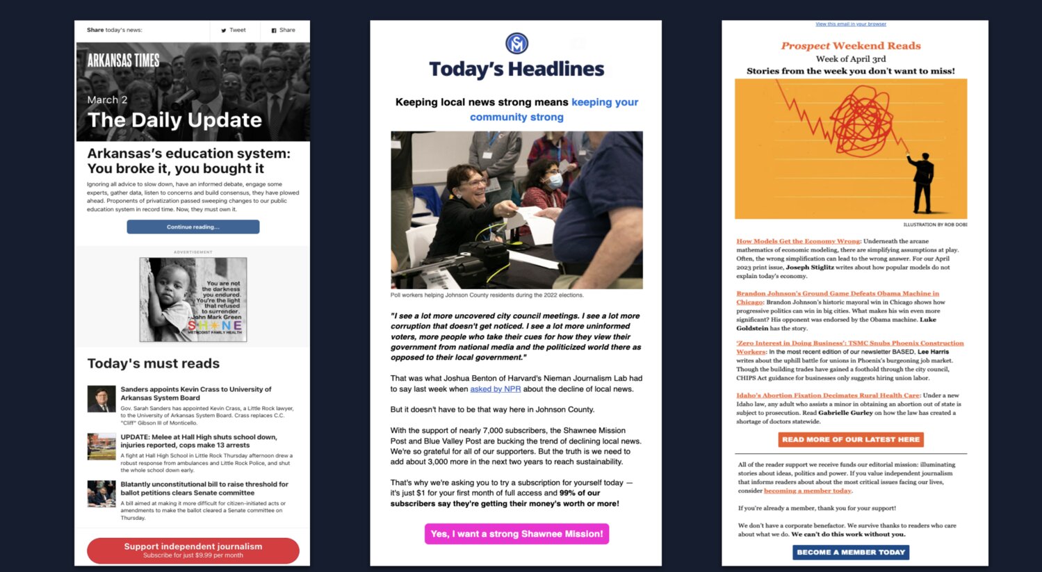
Credit: www.editorandpublisher.com
Engaging Visuals
An engaging newsletter needs more than just words. Visuals play a key role in capturing attention. They make your content lively and easy to digest. This section will cover some of the best practices for using visuals effectively in your newsletter.
Interactive Elements
Including interactive elements in your newsletter can greatly increase reader engagement. These elements make your content more dynamic and entertaining. Here are some ideas for interactive visuals:
- GIFs: Short animations that can illustrate a point or add humor.
- Quizzes: Simple, engaging questions that involve the reader.
- Polls: Quick surveys to gather reader opinions.
- Videos: Short clips that offer more depth on a topic.
Interactive elements do more than just entertain. They also make your content more memorable. Always ensure that these elements load quickly and work on all devices.
Eye-catching Graphics
Eye-catching graphics are essential for making your newsletter stand out. They grab attention and make your content more appealing. Consider the following tips for using graphics:
- Use High-Quality Images: Blurry or pixelated images can turn readers off.
- Maintain Brand Consistency: Use colors and styles that match your brand.
- Be Mindful of File Size: Large files can slow down your newsletter.
- Include Alt Text: Describe your images for better accessibility and SEO.
Consistency in style and quality makes your newsletter look professional. Avoid overloading your newsletter with too many graphics. Balance is key.
| Type of Visual | Purpose |
|---|---|
| GIFs | Add humor or illustrate a point |
| Quizzes | Engage readers with interactive content |
| Polls | Gather reader opinions quickly |
| Videos | Offer more depth on a topic |
Legal And Ethical Issues
Choosing images for your newsletter involves more than just aesthetics. Legal and ethical issues are important to address. Ignoring these can lead to serious consequences. Below are best practices for handling these concerns responsibly.
Copyright Laws
Understanding copyright laws is crucial. Copyright laws protect the creators of original works. Use images legally to avoid fines and legal trouble. Here are some key points:
- Always get permission from the copyright holder.
- Use images from royalty-free websites or public domain.
- Check if the image has a Creative Commons license.
- Always credit the creator if required by the license.
Not following these rules can lead to copyright infringement. It’s important to stay informed and compliant.
Ethical Sourcing
Ethical sourcing means using images responsibly. This includes respecting the rights of the subjects in the images. Here are some best practices:
- Get consent from people in the photos.
- Avoid images that stereotype or misrepresent people or cultures.
- Use images that align with your brand values.
- Ensure images are inclusive and diverse.
Being ethical builds trust with your audience. It also helps create a more positive and respectful environment.
Testing And Optimization
Testing and optimization are crucial for crafting effective newsletter images. Regular testing helps identify what resonates with your audience. Optimization ensures your images load quickly and look great on all devices. This section delves into best practices for testing and optimizing your newsletter images.
A/b Testing Images
A/B testing is a powerful method for evaluating image performance. It involves comparing two versions of your newsletter with different images. Send one version to half your subscribers. Send the other to the rest. Analyze which image performs better. Keep the successful image for future newsletters.
Use tools like Google Optimize or Optimizely for A/B testing. Track metrics such as open rates and click-through rates. This data helps you understand which images engage your audience more. Make data-driven decisions to improve your newsletter’s effectiveness.
Analyzing Performance
Analyzing performance is key to understanding your images’ impact. Use analytics tools to measure engagement. Look at metrics like open rates, click-through rates, and conversion rates. These metrics show how well your images are performing.
Pay attention to user feedback as well. Subscribers’ comments can provide insights into their preferences. Use this feedback to refine your image choices. Continuously monitor performance to keep your newsletters effective and engaging.
Frequently Asked Questions
What Size Should Newsletter Images Be?
Newsletter images should be between 600-650 pixels wide. This ensures they display well on all devices. Always test the images to ensure clarity.
How To Optimize Images For Newsletters?
Optimize images by compressing them without losing quality. Use tools like TinyPNG. This helps in faster email load times.
Why Use Alt Text In Newsletter Images?
Alt text improves accessibility and SEO. It describes the image content for visually impaired readers and search engines.
Can I Use Gifs In Newsletters?
Yes, GIFs can make newsletters engaging. However, ensure they are lightweight to avoid slow loading times.
Conclusion
Using the best practices for newsletter images can improve engagement. Clear, high-quality images attract attention. Proper sizing ensures quick loading times. Alt text helps with accessibility and SEO. Consistent branding maintains a professional look. Avoid clutter; keep it simple and focused.
Test images across devices for the best results. Experiment and see what works best. Keep your audience in mind always. These tips can help make your newsletters more effective. Happy designing!


